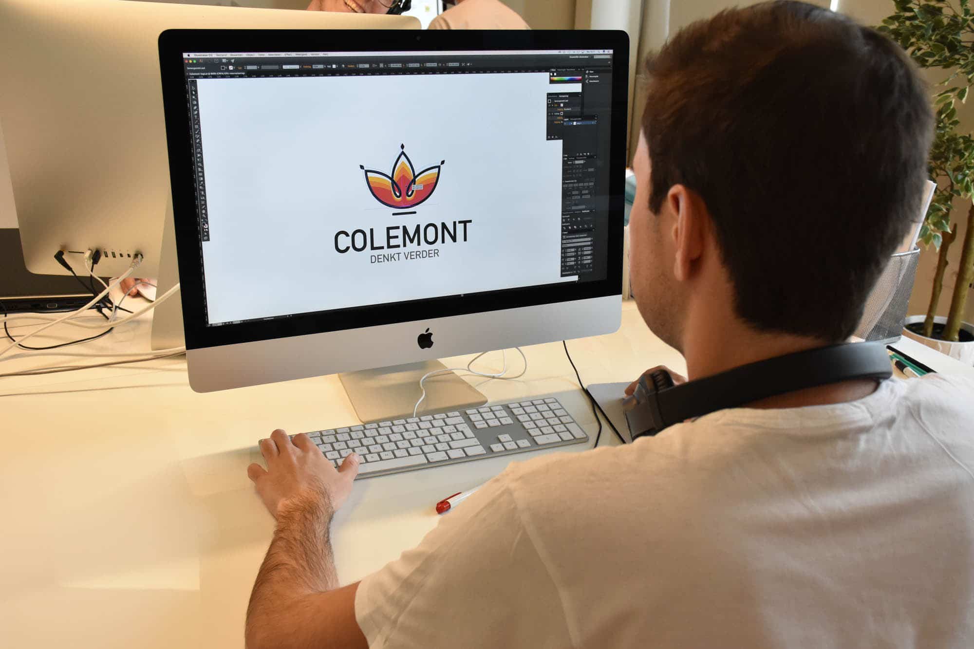
The power of a strong logo
Just got your own business off the ground? Hooray! Now it’s high time for strong branding to put your brand in the spotlight. But what exactly should you look for when putting together a strong logo, and what is the best approach? Don’t worry, I’ll tell you all about it.
Anyone who wants to stand out in the market needs a strong logo. A strong logo is so much more than just a simple symbol. It provides visual recognition to the outside world and contributes to brand awareness and identity. A strong logo only needs a single glance to tell a whole story: who you are, what you do, what you stand for, and who you want to reach.
Furthermore, a powerful logo must be easy to remember. So, go for a simple, clear logo that encompasses everything at once. Or as Jani, the Flemish style guru, would say with a dramatic flourish: ‘less is more’.
Bite-sized tips for a strong logo
By now, it should be clear why it’s best to choose a strong logo. But how does this work in practice? At Expliciet, we always keep the following 6 points in mind during the design process. Respect them, and you will be blessed with a strong logo. Hallelujah!
1. The story
Your logo, no matter how compact, can tell a whole story about your company and brand. Visualize your personal story and try to pour it into a fitting logo. For example: if precision is central to your business, provide your logo with plenty of detail.
2. Your company’s style
Stay true to your company’s style. A logo should make it clear what customers can expect. If you are a more traditional company, don’t go for a bold, modern logo, and vice versa.
3. Go for contrast
Powerful, memorable logos are not characterized by a multitude of colors. Just think of Coca-Cola’s red-and-white style or Nike’s black-and-white logo. It is a strong contrast that contributes to a professional look.
4. What the font?!
Your logo stands or falls with the right font. Do you prefer an elegant font, or are you more inclined toward a sleek, modern typeface? The choice is entirely yours. Always keep your company’s style, sector, and positioning in mind.
5. The power of a vignette
A vignette is all about recognition. It is a specific shape that, together with your name, forms a complete logo. Think, for example, of the heart-shaped emblem of Ola ice cream. Even if you are on holiday in France and the freezer says ‘Miko’, you still know at a glance that it’s the famous ice cream.
6. Strong baseline
A baseline goes hand in hand with your logo. It summarizes your entire business idea in one core sentence that sticks with everyone. ‘Gives you wings’, ‘Just do it’, ‘Schoenen met naam’… Bet you can name the brands right away?